Saturday, April 15, 2017

Creative Critical Reflection

Here's the link (I posted it to my film YouTube account since I didn't want it displayed on my personal account):
https://www.youtube.com/watch?v=LJPk8-zl_Gs

SCRIPT: (not exact, I added some things as I talked)
Hello! My name is Naz Hussein and I have finally finished my final project! Now, for the creative critical reflection, I will begin outlining the research process and the inspiration for my project. Of course, executive order 13769 by President Trump to ban refugees was extremely controversial and affected me as a native of Iraq. At the beginning of my journey, I had not considered my piece to be that of a political statement. Like the magazine I created in the AS Level, I wanted to focus on a more artistic expression. When I visited Vizcaya Museum& Gardens in Miami, I was utterly inspired by the beauty and the location, so I decided that I wanted to film the majority of my footage in Miami. It started out as an idea of showing the beauty and diversity of Miami; however, I was soon taken aback by the order and wanted it to focus on the hardships of an immigrant artist. What inspired me mainly was an article from New York Times detailing the hardships of couples being separated because of the ban. When I read this, I immediately wanted to create a film that caters to an emotional and more humane side of the conflict. This idea was more of a personal inspiration since Arabs especially are so ill portrayed in the media. Prior to starting on the final project, I had extensively researched the portrayal of Arabs in the media, especially Hollywood. There’s a documentary called Reel Bad Arabs: How Hollywood Vilifies a People based on the book by Jack Shaheen that goes in depth on a very negative portrayal of Arabs: they are terrorists, sexists, uncivilized, and anti-Semitic. Moreover, the news nowadays only presents Arabs as a struggling people plagued by war and stuck trying to escape their homeland. Those pictures are very often seen on television and have almost been branded in the Western hemisphere’s mind. Yet, I wanted to show a different side, to break conventions of representation. I wanted to portray the Arab who has experienced trauma as an actual human being with aspirations and passions, so I decided to visit the Iraqi artist. This representation of the Arab social group is very much a deviation from standard representations; yet, my main character, Adnan, is also lonely and estranged. He is awed by the freedom and safety that is present in Miami, along with the beauty of expression. Even so, all of this is broken when the travel ban is instituted and he can no longer see his family, who was bound to follow him. I also used many conventions; however, a very important one: the main trailer and the teaser trailer. It is a convention I often see and from a marketing aspect, it fairly works. The teaser is a shorter trailer that does not specifically outline the plot of the film. It just shows the highlights and clips from the movie. I embarked on research to discover this, as I have detailed in my blog. Allied, a recent film, utilized many of the same clips in both the main and teaser trailer. This is an important fact to not give away the film to the audience. I have also used the convention of the black screen during the main trailer that moves the trailer along, giving snippets of the story. A convention I broke is that I did not use dialogue so much to move the trailer. The trailers only show one actor: this film is more focused on a character and his development. This was more convenient for the limited period of time I had to create this project; plus, I really only had one actor to work with (everyone’s schedule was extremely difficult to work around.) Even so, it worked well with my message since I wanted to focus on the humane side and hardships of someone’s  estrangement. Being stranded in a place where your natives are banned for is quite difficult: how will you react? How will you resist? Will you even resist at all? 

The elements of my production create a sense of branding in 3 ways:
-The font used for the outlaw is unique and eye grabbing
-Artistic 
-For millennials
How is this done? My trailers all show the artistic side of Adnan. My slogan or catch phrase for the film is “Fight with Art”, and this is included in my poster. My website includes the art blog where Adnan supposedly posts his reform to, and I included this on a Tumblr blog specifically since this film targets millennial specifically. this other aspect of my branding, towards millennial, is seen with the young age of the main character and the controversial issue of the ban that millennial social activists are tackling. This is not just a movie for the social activists but for the whole millennial generation since they are all aware of the growing social activist sentiments among the group. Also, the font used for the Outlaw Title has been reiterated in all of my pieces and has the sense of the new growing passionate drive for reform and change. 

My products engage with the audience through the catchy color of the poster. The name of the film too is extremely engaging and intriguing: it brings on a mystery. Yet, what i think creates the most engagement is the controversial topic itself of the ban: it’s still a “hot topic”, so it is bound to attract people from any ideology. Another thing id like to point out is how my teaser trailer features sad, emotional music to make the film look dramatic and engaging in a way that develops the character. Music helped me a lot too through this process, and id like to thank Ross Bugden, a young composer who shares his music for royalty free. Without him, I don’t know where I would find such beautiful music to incorporate into my trailers: for the main one, the music created the suspense and the high and falls of the typical trailer music but not to the extreme degree that action movies are done.
As real media products, I would very much like to focus on more contemporary, technological ways to target the millennial audience. No more flyers or TV ads: I mainly want it to be online and social media based. I placed a huge emphasis on the social media follow on my website because I am aware of the active status of most millennial on such websites. Nowadays, most millennials use Snapchat, Instagram, and twitter. Even though Facebook is still a main social media site, it is failing with the younger millennial generation. Thus, I want to have ads on Snapchat and Spotify, a very popular music application. I also want my social media websites to be extremely engaging and have different techniques to keep up with the audience: for example: Trivia of the day! Poll of the day! What do you guys think? 500 Retweets and we’ll post a sneak peek! Those are the most effective methods to engage with the generation nowadays. Of course, I still want it to be on Facebook as well as on television, but more so the other, more technological aspects. 

I integrated different technologies for this project, for the 

  • Hardware, I used a Tripod, Camera, and Mise-en-scene elements. Those elements were important for setting up the location and appearance of the footage, they are also obviously essential to filming. For example, when we went to Wynwood, I asked Alexis to dress more “artistic” and colorful. But when we went to the airport, I asked him to look more professional with neutral colors: green and black pants. I also utilized my locations carefully: I went to the Miami Airport to film the airport scenes, as well as Wynwood Art District and Lincoln Road in Miami. I fulfilled my initial dream of incorporating a lot of the beauty and diversity of Miami within the film.
  • I used Final Cut Pro to edit my trailers, as well as After Effects to create the black screen with text for the trailers. What was so difficult about After Effects is that everywhere I looked for tutorials, no one explained the simple concept of Scaling, which is what I needed. As you can see here, this is how I created it: I added the text with some simple effects and scaled it so that it would progressively get smaller as time went by. I also used Photoshop extensively for the Movie Poster and looked for tutorials to better my experience: like for example, the Patch Tool and the Spot Healing Brush Tool were extremely helpful since my background had many botched and spots I wanted to remove. I also used Photoshop to edit pictures I used for my website. Finally, I also used Quicktime Player to of course, play the videos and also record this screencast for the CCR. 
  • Online: The most important aspect of this project was the amount of research done online. I initially researched many articles about the ban. What also inspired me tremendously is the presence of social activists on Twitter. I know that many, older individuals frown upon this idea of “fake news”; however, I don’t specifically look at the news they spread but their point of views. I’ve been lost in the course of this election on where I stand on my political views as a native of Iraq living in the US; however, there are many users on Twitter who speak up pridefully and share interesting point of views which I then go to research online and find factual evidence of. Of course, this was an indirect correlation to my project, but this helped fuel my idea and my desire to portray such a difficult and controversial idea in the first place.
  • what also helped me online are font websites that I searched very meticulously to find perfect fonts. Also, tutorials to use all of the software were helpful, especially simple tasks that weren’t so evident within the application, like how to render the video on Final Cut Pro, or press Command D to deselect a selection on Photoshop (which was honestly driving me insane). 

Friday, April 14, 2017

Major Tasks+ Minor Tasks

Trailer #1: Main Trailer
https://www.youtube.com/watch?v=13bomv1ySek

Trailer #2: Teaser Trailer
https://www.youtube.com/watch?v=sJzHB90Goms

Website:
www.outlawmovie1.wixsite.com/home

Poster:


Final Posting

This long journey has finally concluded! Excuse me for not blogging as often, I have been very focused for a whole week now of my spring break on finishing my project. I have only just recently had time to solely focus all of my attention and energy into this. I have been working on it since Monday (legit, I've been home: no beaches, no vacations) and I have absolutely no complaints because that was my plan: I had been extremely stressed from all the schoolwork given to me and could not allocate proper time, but I could finally sit down on my desk and finish it.

On Monday, I filmed my final footage, basing it on the bullet points I listed on what I still needed to film on my previous blog posts. I have been working with Ross Bugden's music to finalize the trailers as well as After Effects.

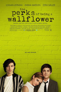
On Wednesday, I sat down and worked on the poster. The original picture for the poster is this, and in the next blog posts you'll see how I changed it and edited it (after hours of Photoshop). While designing my poster, I heavily based it off the Perks of Being a Wallflower poster. This poster didn't necessarily put the credit at the bottom of the picture but on the top, which is what I did.


On Thursday, I was inspired by the Danish Girl movie website and tried to create a slideshow of pictures. Moreover, I sat down for extensive hours and created social media sites, spreading the word and trying to attain followers.

Today, Friday, I wrote the script for my Creative Critical Reflection and began to piece everything together. I didn't create just a screencast or just a slideshow, I created a mix of both as well as a voiceover. 

There, I cannot believe it! I am proud to say that I have officially finished my AICE Media A portfolio project! I hope everyone enjoys my products. 

Saturday, April 8, 2017

CCR Brain Storming

How do your products use or challenge conventions and how do they represent social groups or issues?
  • My product challenges the convention of portraying the Arab as the "bad guy". For once, the Arab is visited as a natural human being, with a family and passion. Yet, my character is not just a social group: he is an artist, unconventional, newly estranged to a country. I have utilized the convention of trailer+ teaser trailer; plus, the convention of the movie website and movie poster is already set in stone. Yet, for me, I have also utilized the text and black screen describing the film in the main trailer as a convention. The challenging conventions portion comes with the teaser: it'll be played solely with music in the background.

How do the elements of your production work together to create a sense of ‘branding’?
  • All of my separate components incorporate an artistic element within. I am planning to make the website artistic and appealing to the youth; moreover, the branding is for younger millennials. Even though I don't want my film to be focused on the art (as I have explained previously), adding this artistic element with the movie poster and trailers make it appeal to the audience more easily.

How do your products engage with the audience and how would they be distributed as real media products?
  • My main trailer tells an interesting, controversial story, which is bound to catch the audience. This hot topic is bound to receive reception, whether negative or positive, so I will take advantage of that. I will make a Twitter, Instagram, and Facebook page for my movie and be active on it. I will also have to find ways to be incorporated into popular applications as an advertisement, such as Spotify or Snapchat. I want my movie poster to be spread throughout the Internet; after all, this film is for the younger, Internet dependent generation. Distributing flyers isn't going to help me much with this one.

How did you integrate technologies – software, hardware and online – in this project?
  • Hardware: Tripod, Camera, Mise-en-scene: those are all obviously very important to filming and setting the "vibe" for the film. I asked my actor to dress more "artsy" for the Wynwood scenes and more professional for the airport scenes.
  • Software: Final Cut Pro, AfterEffects, QuickTime: I play the videos on Quicktime while I edit them on the other two applications
  • Online: Of course, there's all the research done with the subject (articles), as well as the research for the artwork, technical aspects of the project, and marketing. As I get closer to making the website and the social media websites, I will definitely be embarking on more research. There's never enough research!!

Friday, April 7, 2017

Art+ Filming

Yes, I am a little behind on the filming, I know, but I plan to do the rest very soon. I'm not too worried since I already have my music and the basics down, I just need to film and edit the rest of my content into the trailer, which isn't much, since I have already filmed most of it.

I have decided not to incorporate the bedroom flashback scene since I honestly don't have the resources for it. My main character actor lives extremely far and it is difficult to arrange going to his house; yet, I am still considering the scene where he is cowering under a table or on the floor. I know, this also requires a house, which is why I'm still hesitant. Yet, I can even do this scene on a street or an alleyway: all I need is the bomb sound effects to get the message across. If this becomes the case, then no problem!!

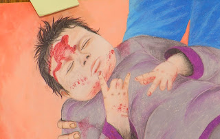
Also, the big artwork piece is done: just needs a bit of coloring. The artist has been sick this whole week, so I'm giving him a break, (plus I don't want him to sneeze on it, that won't look enticing on the camera).


(This is an older picture, I'm not posting the newer version just yet!)

Thursday, April 6, 2017

Music

There is an amazingly talented young boy on YouTube called Ross Bugden. I was so thankful and shocked by his music that I had to subscribe and follow him on Twitter. I mean, he is only 16 and dedicates plenty of his time to composing beautiful, royalty free music for everyone to relax to and use!!

A lot of his works are titled "Trailer", meaning that they work best for trailer projects. And yes, they really do! I will definitely be using his music in my trailer since he has such a wide variety and fitting music. I was honestly getting extremely desperate looking for trailer music on royalty free websites, they are awful!

My favorite tracks include:


Those are not meant for trailer specifically but they suit mine so perfectly. I was thinking that the one titled "Beautiful and Emotional Music" will fit my teaser trailer beautifully, since I have been considering only putting music as sound for it. It will suit the series of events I have planned in my head.

As for the other ones, the Epic and Dramatic Trailer Music track has been very favorable to my own trailer. I think I will use this throughout; yet, my trailer will probably be slightly shorter. Even so, I can always fix that while editing (no biggie!!)


Wednesday, April 5, 2017

AfterEffects Part 2

I have finally made good progress with my smoke AfterEffects trials!!

The one that I previously posted did not look very professional, so I have changed it.


Yay for me figuring this out!! I have done more of these, yet I am not sure if I am sticking with the exact same words yet, due to the unexpectedness of editing. Yet, this is what I have desperately needed, along with the music, which I will dedicate another post to! 
'

Tuesday, April 4, 2017

AfterEffects

Hello!
I have been searching the Internet aimlessly for Aftereffects tutorials. It is an extremely complex software to use, really. My top two tutorials that have helped include:


Even those, however, have been fairly challenging. So, today, I took it upon myself to ask a more knowledgeable classmate and he showed me the simplest of tools required for text motion: scaling.

He has honestly been a great help since I have been searching for this for a very long time and have not found it. I know I sound like an awful beginner, but I am, so I am content with this miraculous discovery. 

I will be putting together more text in between the tutorial. So far, I have created this: 

More updates to come in the next posting!!


Thursday, March 30, 2017

More Editing Updates

So for the motion media design of the words (that are going to appear on the black screen throughout the intervals), I have downloaded Adobe Aftereffects (the trial) to accomplish this. I also will use this to design the title of the film at the end of the trailer. I am going more into the technical aspects of creating the trailer; for example, the sound design. For the beginning of the trailer, I want a slow, suspenseful music that will introduce the setting and situation. Then, I also want music that crescendos and shows the high points of the film.

I am mainly using Free Music Archive to obtain music; yet, I am still looking for the best music. I also have to figure out a way to display some dialogue with the music in the background. I need to record my actor saying some words in order to have the sound clearer, since there has been so much background noise with the video shootings.

Also, I have started thinking about the teaser trailer. How will I portray it, and how different will it be from the main trailer? I think that for the teaser, there will be almost no black screen to narrate the events of the film. The teaser does not give the story or plot; it mainly shows the highlights of the film without making it look too choppy. So, I will change the sequence of the events slightly from the main trailer and show different shots of the same scene every now and then (even though I shouldn't incorporate too many different shots, if they are still portraying the same location and situation, then that isn't really giving too much of the film away as long as I place an adequate amount of shots from the main trailer.) I might show some landscape shots at the beginning, then the airport, then the Miami enjoyment (Wynwood then Lincoln again since Lincoln was shot at night, it would be strange to show night shots before day ones? But perhaps I can make it work when I begin working on it.)

So, for what I still need to film:

  • My character finding out about the ban through a digital device
  • My character viewing the Tumblr blog of art 
  • My character creating art on a big paper while kneeling on the floor
  • My character desperately trying to contact his family through Facebook after finding out about the ban

Wednesday, March 29, 2017

Possible Ideas to Fix

What I am still considering is filming some shots that highlight the difference between the character's background and the current place he lives in. For example, I have a vision of the character waking up at night to a thunder noise and having a flashback to him cowering at the sound of bomb explosions. I'm not sure if this is the message I want to convey, but it is pretty realistic to the Iraqi situation and helps establish that the character is, indeed, estranged and not completely familiar with the atmosphere around him.

Showing the character immediately adjusting to the environment and enjoying Miami might give off the wrong message, since I couldn't exactly get shots of the character being surprised. I tried to have my actor look astonished and murmur a "Wow!", but it honestly just sounds too cheesy and cliche. So, to fix this problem, I might shoot the scene that I have just described; yet, I am not sure if it will fit within the main trailer. Yet, since modern trailer have been becoming longer, I don't think it would be a huge obstacle if the trailer is around 3 minutes or a little bit less.

My problem with the scene is that I don't want to portray the character as generic or having the character only defined by the hardships of his life. The film is not just about the ban or the situation; it is about the character and his journey of voicing his opinion. It's about removing a misrepresentation and stereotype that people in third world countries have nothing to do except struggle and (be in a third world country.) People there, in fact, can be extremely intelligent and unique; like my character, who is fascinated with art and the skill of spreading collective purpose through art. It's a call for unification.

I have looked at some films that effectively make use of flashbacks. An article that his really helped me is on this link. One film that I have really enjoyed the flashbacks for include Big Fish (I have seen the trailer and how they incorporate the flashbacks). I am just unsure of whether this is something I want my film to be a part of. The flashbacks are not a recurring thing throughout, they are just there for a maximum of two times to narrate the difference and dislocation the character feels.

Tuesday, March 28, 2017

Update with Editing

For my first trailer, the main non-teaser one, I have had progress with editing in terms of placing the events in sequence and the black screen of the trailer descriptions. What I am first showing is the airport scenes that I shot; for example, snippets that reveal it's in a Miami airport and that the main character is of Iraqi origin (with the passport).

Then, I have incorporated several landscape shots establishing the setting as Miami; for example, a Miami shuttle bus and a shot that presents a landscape movement. This serves as a transition from the airport scene to the Wynwood scene: introducing the art and the lively atmosphere within Miami. This is to highlight the awe and beauty of Miami and how that contrasts with the character's background.

Then, there are snippets shot during the night in Lincoln Road. The transition to the conflict of the film is shown with the character discovering the ban, which will probably be read from a digital device. I want to portray the character's struggle as he desperately tries to connect with his family through Facebook; those recurring digital references reflect the tech-savvy reality of millennials as well as serving as an appealing factor to my target audience. Those so far are what I have edited for my main trailer; I think that I still need to consider some options (detailed in the following blog posts), but it sets a solid base for the sequence as well as the message I am trying to convey.

Saturday, March 25, 2017

Independent vs Mainstream

I am still unsure of whether to marker my film as an independent film vs that of a mainstream film. Typically, independent films have reputations of being too low-budget and too disadvantaged to be considered worthy. The newly released independent films have had to combat this criticism; for example, social media accounts (including Youtube comments) are reflecting both a rejection and acceptance of the independent film trend.

Yet, even with the subject matter I have, I can still transform into a "mainstream" film. A lot of the subject matter and artistic vision that is usually characterized by independent films has moved into the mainstream field, with recent movies like La La Land, Moonlight, The Grand Budapest Hotel, and Blue is the Warmest Color. This new trend is also accompanied by "mainstream" actors that have popularized the movie, with the case of Dev Patel and Nicole Kidman in Lion. To "mainstream" my film, there needs to be a component that is appealing to the public itself. The controversial subject matter is bound to attract individuals with any belief system; however, I am still looking for that one component. Maybe the actor? Or the location of Miami? Or the artistic content it spans?

It would be much easier to market this as an independent film, yes. The film would have already found a niche and been upraised by the younger, more socially aware groups; yet, the message of this film is broader than a mere niche. I can target this to a younger, Generation Z audience, yet I am hesitant about the independent film niche. It would not get as much reception or it wouldn't be taken as seriously: it would just be that "Arab movie" as opposed to that "Arab movie that everyone is talking about".

Friday, March 24, 2017

Update on Filming+ Artwork

I have filmed my main character protesting. I have previously mentioned how a highlight of the movie is his loneliness and his resort to art and the internet for comfort. Thus, I have been toying with the idea of emphasizing the transition of his protests from mere posters, alone, where he is not heard, to an evolution of art and how the reform movement grows beyond the traditional ways of protesting.


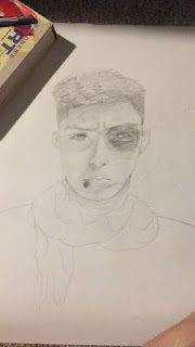
There is also a slight progress on the artwork to be incorporated within the Tumblr blog:


Those art pieces are on a smaller journal, yes, but they will be individually scanned and displayed on the blog as professional pieces. This is merely a sketch, and even though it is delayed, I am focusing on the artwork right now since it is essential in filming as well as in creating the movie website and the poster. I want to see what the final product for the artwork is and if that is satisfactory enough to incorporate into my whole marketing campaign. 

(Art by Alexis Sanchez)

Thursday, March 23, 2017

Movie Posters

I am looking at movie posters to draw inspiration from. I have an idea to make the movie poster a drawing or art piece; however, I am still hesitant about this from a marketing perspective. From the research I have done, movies with artworks are either animation or old.
Casablanca, 1942

I have been looking for recent movies with artworks as movie posters yet have not found any. Even (the more successful) independent films utilize a digital form of art in some shape to market their films. Thus, I have decided that this most likely would be the safest route. However, utilizing a particularly vibrant art piece can also reflect the revolutionary content of the film: the movie poster breaking rules. Yet, I feel like that is stretching it (maybe just a little bit?) 

Some particular movie posters that have captured my attention include: 


I am unsure of what the Grand Budapest Hotel movie poster is made of, but it appears more as an art piece. This correlates most closely with my vision of a movie poster; perhaps I can ask a friend to draw and help me fulfill my vision of the art poster. However, since I am not an artist myself, my choices are limited. Yet, I want to try both and experiment until I decide which one represents my film on a wider scope. 

Tuesday, March 21, 2017

Website Research

Since I am still working on collecting a decent amount of artwork, I have resorted to researching about film websites and thoroughly considering how my film can be represented.

The Perks of Being a Wallflower website features a basic layout with "home", "movie reviews", "about the movie", "gallery", and "story" tabs. The background for the website is the lime green the movie is noted for; however, I think this is a poor choice considering that lime green is difficult to conceive.

The Dope website, however, was non-traditional and explicitly target the younger, Generation Z audience. It features a website with a playback of videos in the background and a song from the soundtrack. The pointer for the keypad and the website
imitated a video game style, and a large emphasis was placed on social media.


As seen from this screenshot, the three main tabs above are "share", "follow", and "dashboard'. I want to follow this trend of strictly appealing to the younger generation and placing emphasis on social media; however, I cannot market it in a similar, lively fashion as Dope is marketed since my film constitutes of a heavy, more dramatic subject matter. 

The Danish Girl is composed of a heavy subject matter. The website for it is under Focus Features and is not thoroughly detailed: it mostly markets the purchase of the film and the social media components. The content for "about the film" is fairly limited, yet the website remains presented in an elegant, beautiful design, reflecting the artistic presence of the film. I want to borrow from this artistic presence and place it in my website. 


As seen, this beautiful still shot is composed nicely with the font and the diamond shape in the middle. Now that I have a basis for what I want my website to look like, I can begin photographing still shots for the website, and to incorporate more behind the scenes shots as part of my marketing campaign. 


Sunday, March 19, 2017

Artwork

The vision I have for the artwork in my trailer is not limited to explicit political statements or caricatures. I want the artworks to exhibit emotion and show the human condition of individuals living in countries plagued by war. There can be a display of devastation; yet, there should also be a resistant hope shown. I have stumbled upon articles (links below) that include art by Syrian refugees. The subject matter corresponds perfectly to my vision.


There is also an existing project similar to my vision called The Refugee Art Project. It showcases art from refugees to Australia who are stuck in detention centers. Artists are from: "Afghanistan, Sri Lanka, Iraq, Iran, Syria, the Kurdish regions of the Middle East and Burma."

Mahmoud Salameh

Mahmoud Salameh

Syed Ruhollah Musavi, 'Religious Elegy', oil on canvas, 60x85cm.

H, H, 'Afghan landscape', oil on canvas, 21x16cm.

I will begin to lay the exact details for what the message should be for the artworks. They will not be completely polished; yet, they will suffice the purpose of being displayed on the blog and for a quick shot of my main character drawing.
  
http://english.alarabiya.net/en/variety/2017/01/18/PICTURES-Syrians-refugees-depict-their-pain-and-struggle-through-art.html
http://www.npr.org/sections/goatsandsoda/2016/03/17/470809097/syrian-refugee-kids-were-told-to-draw-whatever-they-wanted
http://therefugeeartproject.com/home/the-cartoons-of-mahmoud-salameh/
http://therefugeeartproject.com/home/memories-of-home/